

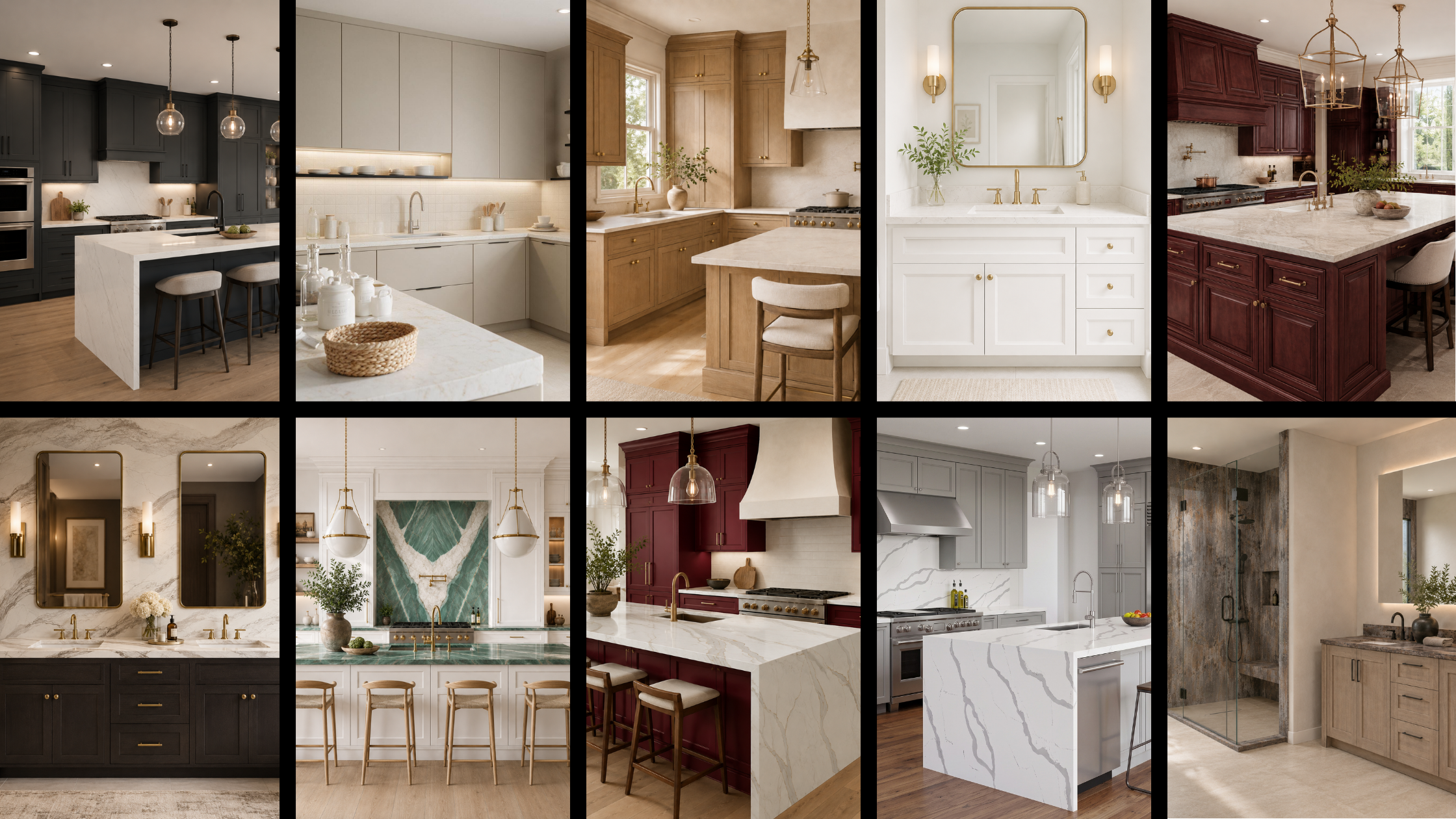
10 Cabinet and Countertop Pairings for Every Project: A Practical Design Guide
What cabinet and countertop combinations work best together? The strongest pairings either create intentional contrast or repeat a compatible undertone. Dark cabinetry often benefits from a lighter surface, warm wood works naturally with warm whites and controlled veining, and compact rooms usually feel calmer with lower-contrast combinations.
The right choice also depends on more than color. Natural light, room size, flooring, backsplash, hardware, maintenance needs, and the amount of visible countertop can all change how two samples look once they are installed.
For homeowners, contractors, builders, and designers comparing cabinets and countertops in Maryland, Washington D.C., Northern Virginia, or the wider DMV, the ten combinations below provide practical starting points for kitchens, bathrooms, islands, mudrooms, laundry rooms, and other built-in storage projects.
How to Pair Cabinets and Countertops
Before choosing a specific combination, compare the materials in the same lighting and consider four basic design decisions.
Check the undertones. A surface may appear white, gray, beige, or brown at first glance, but its undertone determines what it works with. Warm wood usually relates more naturally to cream, beige, taupe, or warm veining than to an icy blue-gray surface.
Decide how much contrast the room needs. High contrast creates definition and works well on islands, long cabinet runs, and larger rooms. Lower contrast feels quieter and can make a compact kitchen or bathroom look less divided.
Control the pattern. If the cabinet finish has strong grain or color variation, a restrained countertop often keeps the composition balanced. If the cabinet is simple and uniform, the countertop can carry more movement.
Look beyond the two samples. Flooring, wall color, backsplash, hardware, appliances, and adjacent rooms all affect the finished result. A pairing should belong to the whole project, not only look good on a sample board.
1. Clean Contrast

Fabuwood – Tuscany Antracita


Cosentino – Ethereal Noctis

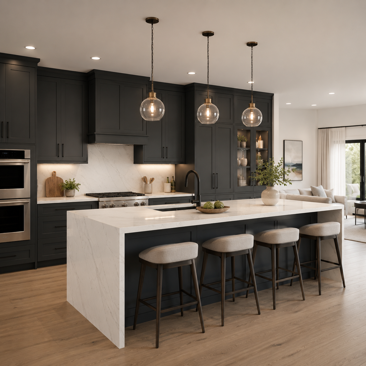
Clean Contrast
Tuscany Antracita gives the cabinetry visual weight, while Ethereal Noctis introduces a brighter plane with controlled movement. The contrast defines the cabinet profile without making the kitchen depend on a completely plain white surface.
Best for:
- Larger kitchens
- Islands
- Open-plan layouts
Design tip:
Use the lighter countertop to break up long runs of dark cabinetry, especially when natural light is limited. Warm white walls or a restrained backsplash can keep the room open without weakening the contrast.
Do:
Repeat one of the countertop’s darker details through hardware, lighting, or a small accent.
Don’t:
Add another strongly patterned backsplash. Three competing focal points can make the room feel restless.
2. Soft & Contemporary

Waypoint Living Spaces – 530 Oat
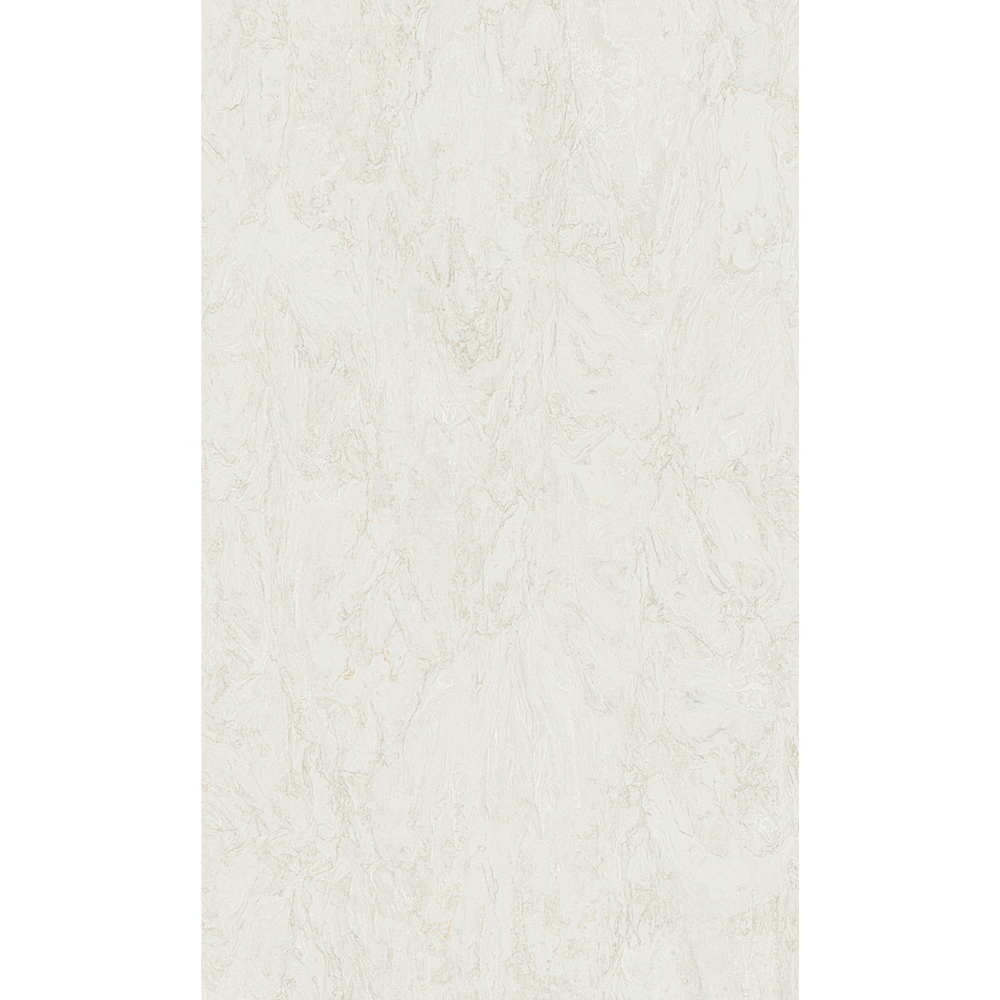
MSI Surfaces – Taravataj
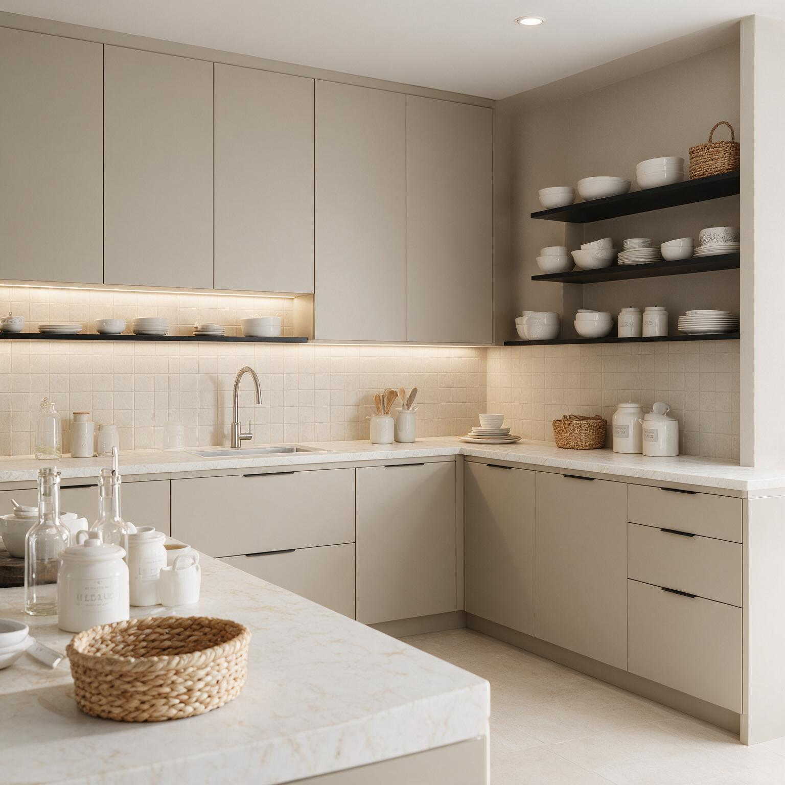
Soft & Contemporary
This is a low-contrast combination built around soft neutral tones. The cabinet and countertop sit close enough in value to make the room feel continuous, while subtle surface variation prevents it from looking flat.
Best for:
- Compact kitchens
- Condos
- Bathrooms
- Contemporary interiors
Design tip:
Add definition through matte black, brushed nickel, or restrained bronze hardware rather than introducing another strong color across a large surface.
Do:
Compare the samples against the actual flooring. Quiet neutral schemes depend on small undertone differences.
Don’t:
Assume every beige or greige material belongs to the same palette. One may lean pink, yellow, green, or gray under interior lighting.
3. Warm & Natural

TA Cabinetry – TSK

MSI Surfaces – Lumataj

Warm & Natural
Wood-toned cabinetry brings visible texture into the room, while a warm white or softly veined countertop keeps the result light and usable. The combination works particularly well when the kitchen connects to living or dining areas with other natural materials.
Best for:
- Transitional kitchens
- Open-plan homes
- Breakfast areas
Design tip:
Use the countertop as a visual bridge between the cabinetry and lighter walls, backsplash, or upholstery in the adjacent room.
Do:
Bring flooring and wall samples into the comparison, especially if the home already contains wood.
Don’t:
Pair the cabinetry with a very cool gray surface. It can make the wood appear dull or more orange than it does on its own.
4. Light & Airy
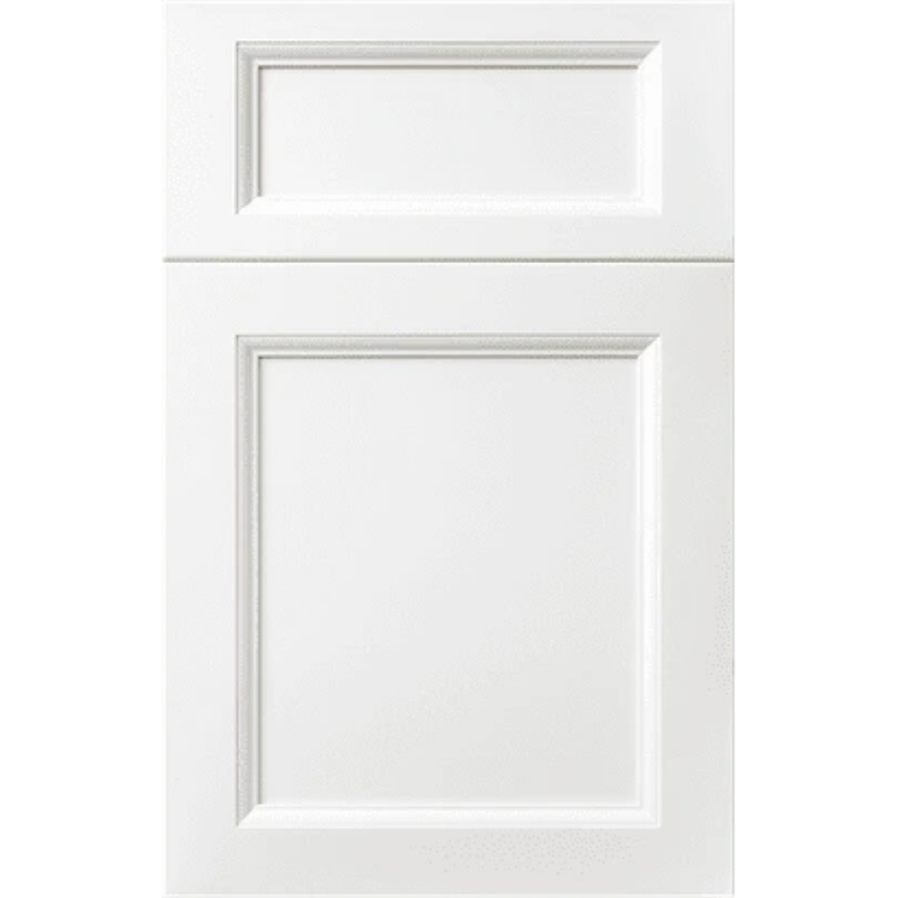
Vita Cabinetry – Trillion White

Cambria USA – Swanbridge

Light & Airy
Keeping both major surfaces light helps preserve brightness and reduces visual breaks in a small room. Swanbridge adds enough movement to separate the countertop from the cabinetry without turning the surface into the dominant feature.
Best for:
- Small kitchens
- Galley layouts
- Bathrooms
- Spaces with limited natural light
Design tip:
Introduce warmth through flooring, lighting, wood accessories, or warm metal hardware so the room does not feel overly cold or clinical.
Do:
View the cabinet door and countertop vertically as well as flat; light reaches them differently after installation.
Don’t:
Select the wall paint from a screen. White finishes can shift noticeably beside each other.
5. Bold & Grounded

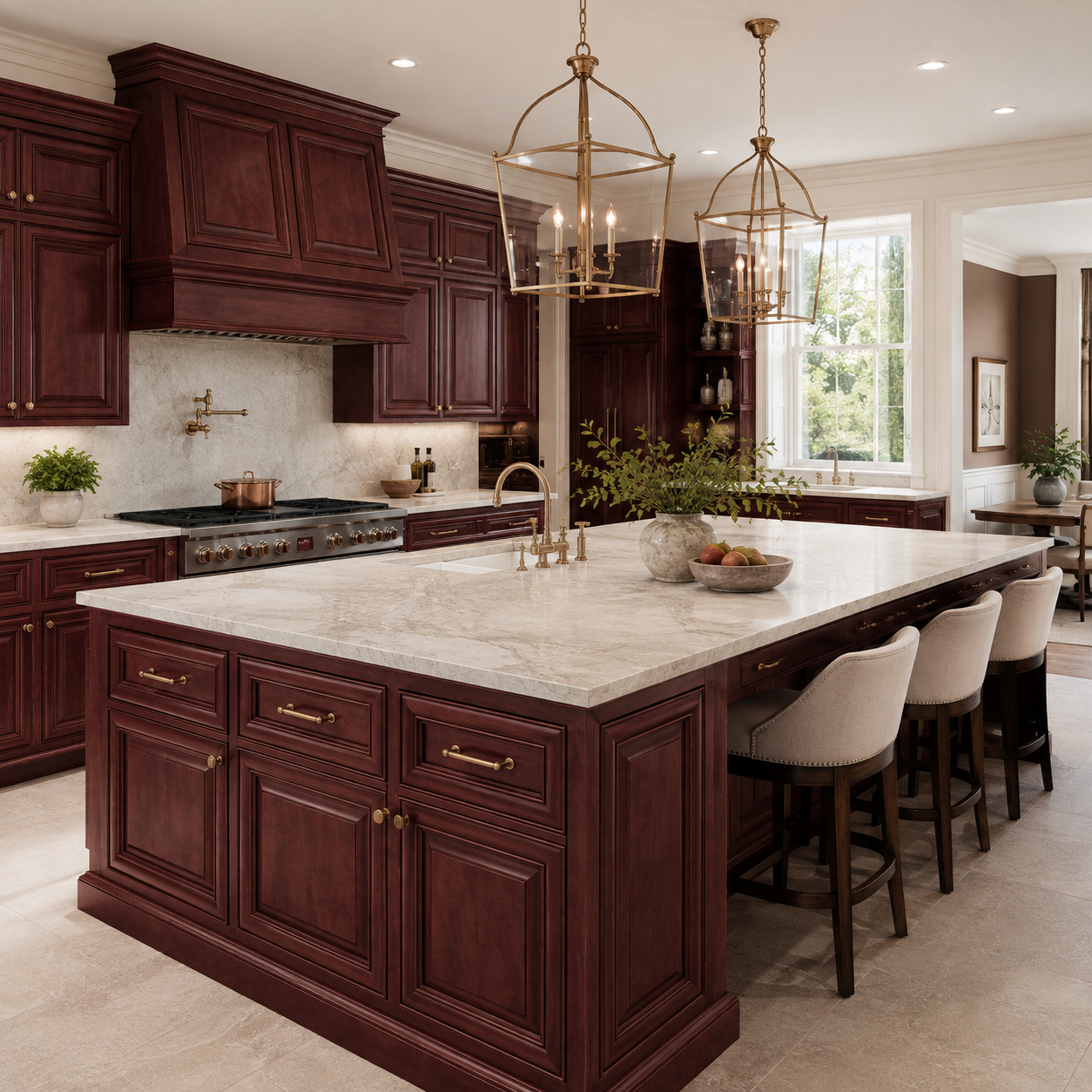
21st Century Cabinetry – Sedona

Atlas Plan – Appennino
Bold & Grounded
Sedona gives the design a rich, grounded base. Appennino adds movement and a lighter mineral character, keeping the cabinet color from taking over every visible surface.
Best for:
- Spacious kitchens
- Statement islands
- Larger vanities
- Rooms with strong natural light
Design tip:
Let the cabinetry lead and keep the surrounding walls, backsplash, and major furnishings lighter. This gives the deeper cabinet tone enough space to read clearly.
Do:
Use the combination where the room has sufficient scale or light to support it.
Don’t:
Repeat similarly strong red-brown tones across the floor, walls, and furniture. The cabinet should feel intentional, not surrounded by near-matches.
6. Rich & Refined

Fabuwood – Galaxy Cobblestone

Cambria USA – Windsor Brass Satin Ridge

Rich & Refined
Galaxy Cobblestone provides a deep neutral foundation, while Windsor Brass Satin Ridge adds controlled movement and warmer detailing. The result has more visual formality than a simple black-and-white scheme without relying on decorative cabinetry.
Best for:
- High-end kitchens
- Larger bathrooms
- Formal entertaining spaces
Design tip:
Allow the countertop to be the most expressive surface. A simple backsplash and disciplined hardware selection will keep the veining visible without crowding it.
Do:
Review the full slab or a large-format image before deciding where the strongest movement should fall.
Don’t:
Judge a directional pattern from a small sample alone, especially for a long island or full-height backsplash.
7. Fresh & Organic

Waypoint Living Spaces – 470 Linen
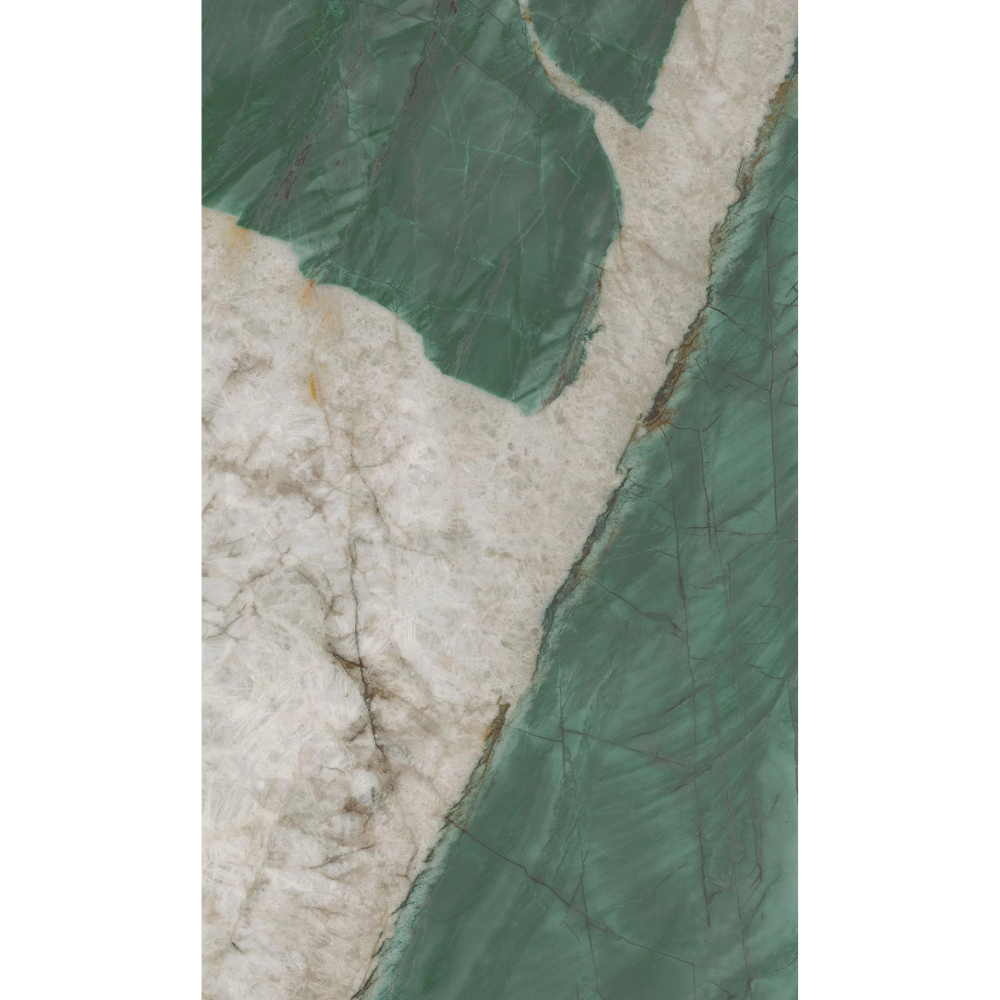
Atlas Plan – Exotic Wave

Fresh & Organic
The quiet cabinet finish gives Exotic Wave room to become the focal point. Its visible mineral movement adds color and natural variation, while the surrounding cabinetry makes the overall look practical and usable, not just a single statement surface.
Best for:
- Kitchens
- Bathrooms
- Mudrooms
- Transitional spaces that need a stronger natural reference
Design tip:
For a stronger feature, continue the stone onto a backsplash or use a carefully planned bookmatched layout. Keep the remaining finishes warm and restrained.
Do:
Choose the exact slab area and pattern direction deliberately.
Don’t:
Add multiple unrelated green, gray, or beige materials in an attempt to match every color in the stone.
8. Color-Forward

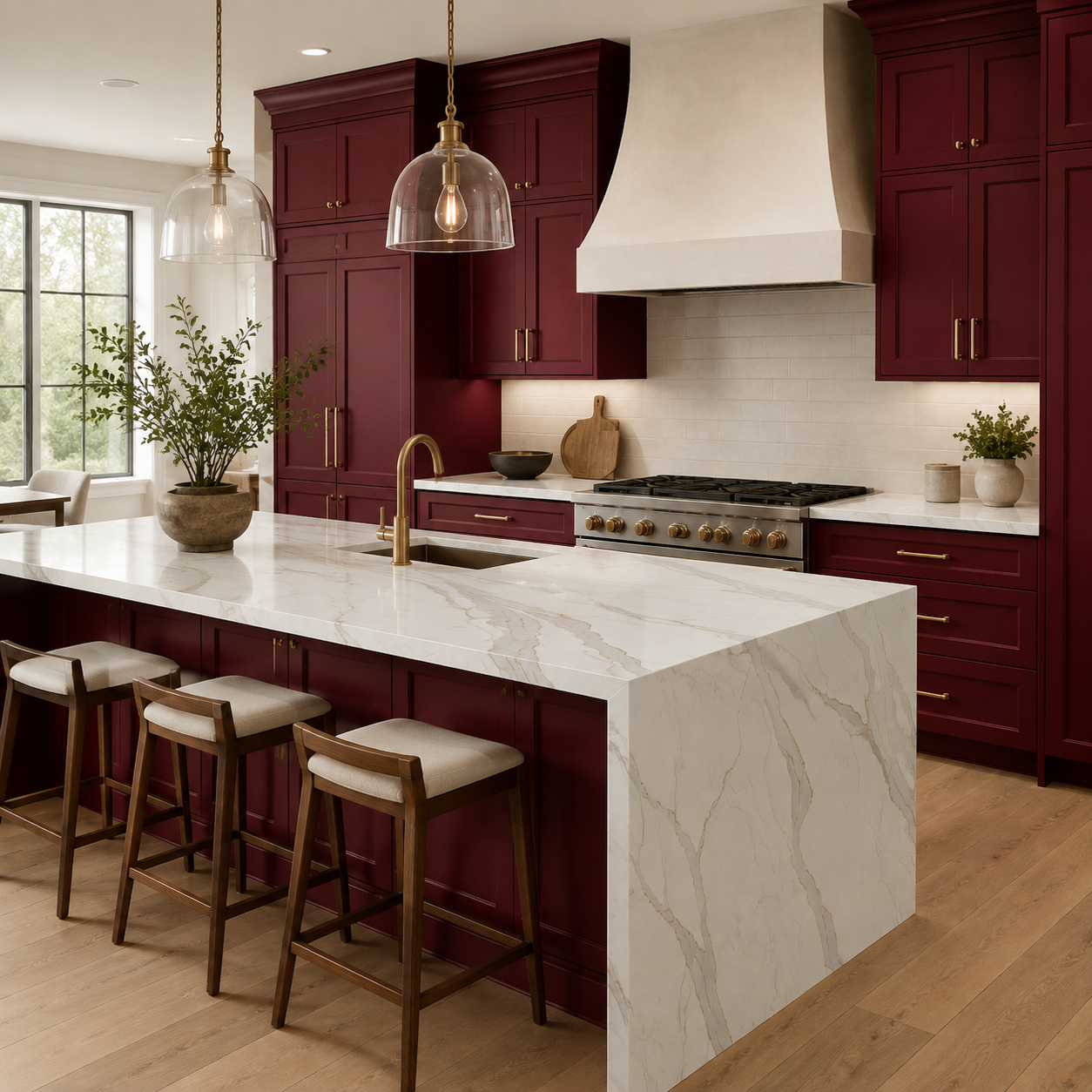
Fabuwood – Nexus Cabernet Red
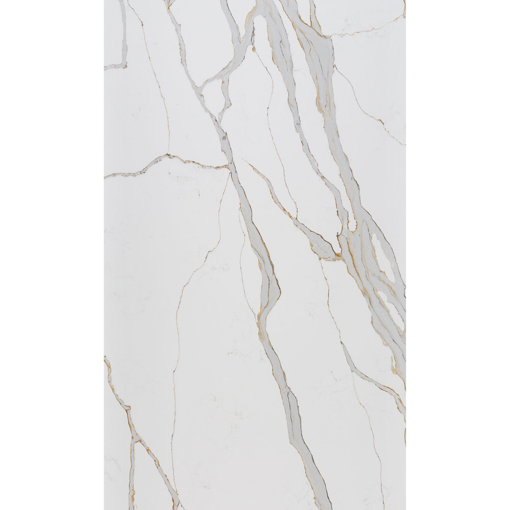
MSI Surfaces – Calacatta Solessio
Color-Forward
Cabernet Red gives the room a deep, saturated color, while Calacatta Solessio introduces a bright white surface with flowing gray and gold veining. The quartz lightens the overall composition without muting the cabinetry, making the combination expressive but visually controlled.
Best for:
- Medium-to-large kitchens
- Statement islands
- Open-plan layouts
- Rooms with strong natural or layered lighting
Design tip:
Use brushed-brass hardware to pick up the gold veining, then keep the walls and backsplash warm white. This strengthens the connection between the two materials without adding another dominant finish.
Do:
Review the slab layout before fabrication so the strongest gray-and-gold movement lands on the island or waterfall edge.
Don’t:
Add a competing patterned backsplash or repeat deep red tones across the flooring and furniture. The combination already provides both color and movement.
9. Contractor-Ready
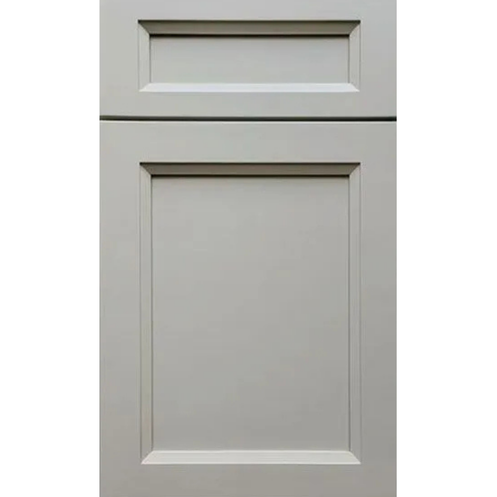
NKBC – Eternal Platinum

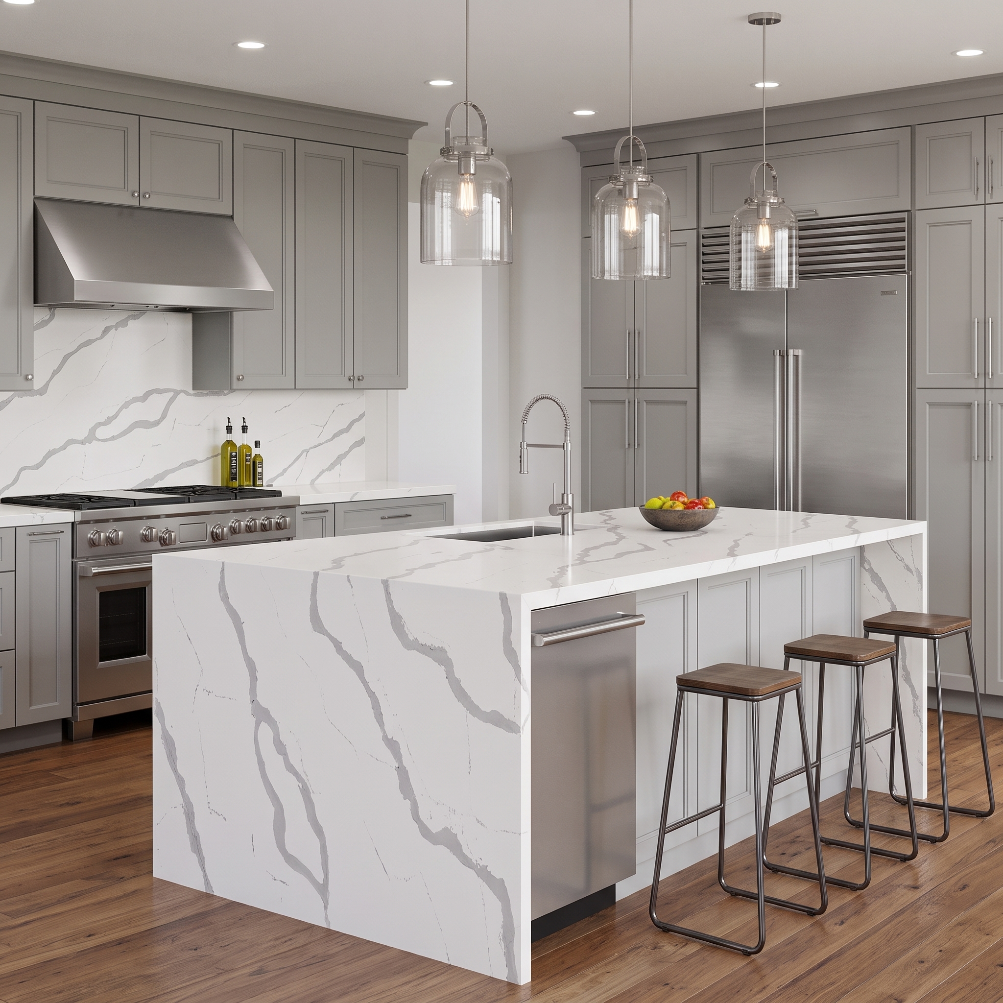
Cosentino – Bianco Calacatta
Contractor-Ready
Eternal Platinum provides a neutral gray base that works with a wide range of flooring, hardware, and appliance choices. Bianco Calacatta adds a bright white surface and clear gray movement, creating contrast without tying the design to a narrow color palette.
Best for:
- Spec homes and resale projects
- Rental and multi-unit properties
- Kitchens with mixed existing finishes
- Projects requiring flexible finish choices
Design tip:
Use chrome or brushed-nickel hardware to reinforce the gray tones, then introduce natural wood through flooring or open shelving to keep the room from feeling too cool.
Do:
Compare the door, slab, and flooring samples under the project’s actual lighting before finalizing the specification.
Don’t:
Add another high-contrast pattern on the backsplash. Bianco Calacatta already provides enough movement to carry the design.
10. Wood & Dramatic

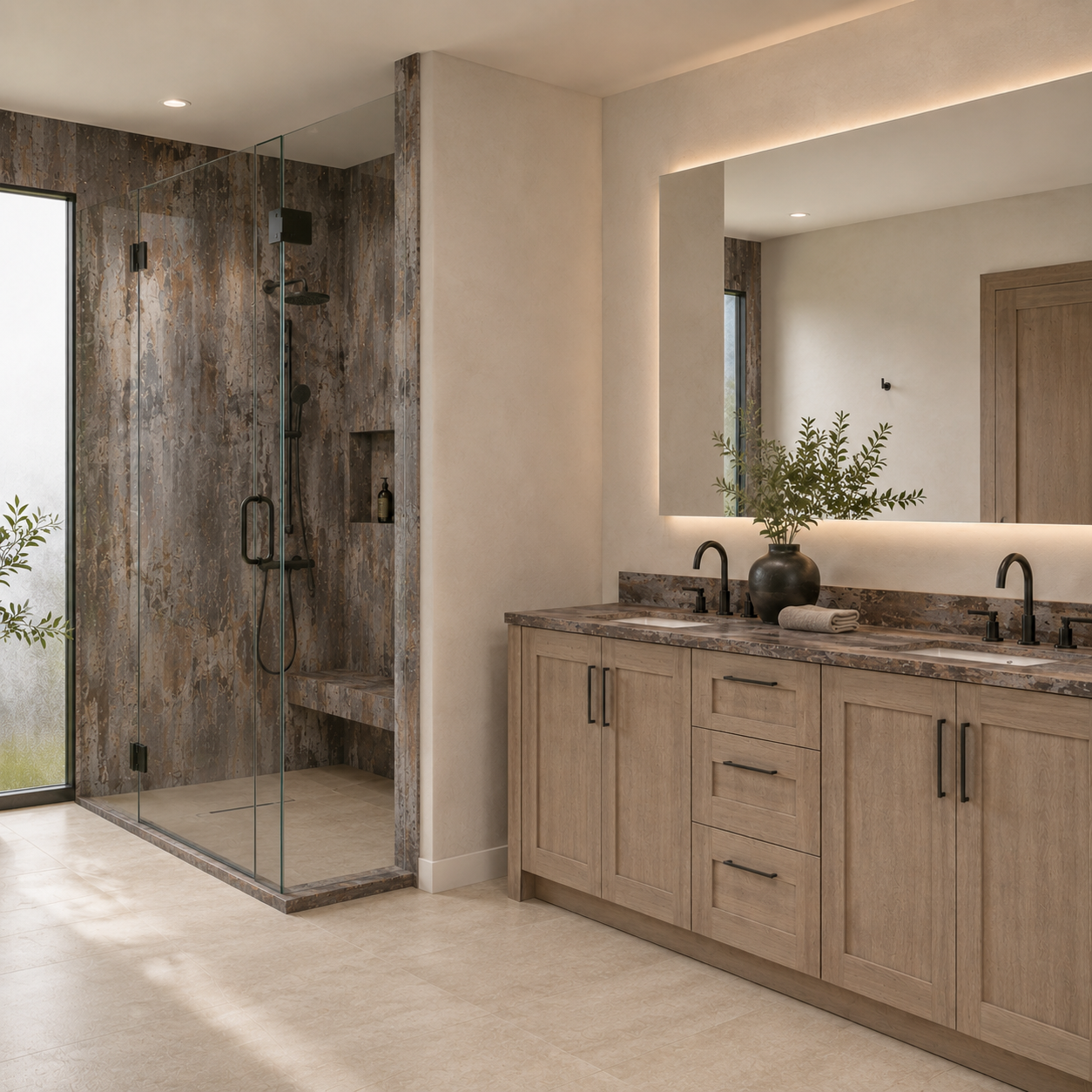
Waypoint Living Spaces – 410 Almond

Cosentino – Trilium
Wood & Dramatic
410 Almond brings a soft, natural wood tone that keeps the room approachable. Trilium adds depth, movement, and a darker industrial edge. Together, they create drama without relying on dark cabinetry throughout the room.
Best for:
- Primary bathrooms
- Spa-style showers
- Statement kitchens
- Rooms with balanced natural or layered light
Design tip:
Use the wood across the larger cabinetry areas and reserve the darker surface for one clear focal point. This allows the grain to soften the composition while the patterned surface provides the drama.
Do:
Surround the pairing with warm neutrals and controlled lighting so both the wood grain and surface movement remain visible.
Don’t:
Layer in additional dark finishes or heavily patterned materials. Too many competing focal points can make the room feel busy and closed in.
Which Pairing Fits Your Project?
The room and project type can narrow the list before individual samples are compared.
For a small kitchen, galley layout, condo, or room with limited natural light, begin with Light & Airy or Soft & Contemporary. Both reduce sharp visual breaks and preserve brightness. Clean Contrast can still work in a smaller space when dark cabinetry is limited to lower cabinets or one defined zone.
For a large kitchen or statement island, Clean Contrast, Bold & Grounded, Rich & Refined, and Wood & Dramatic have enough definition to hold their own across a larger surface. Review full-slab movement and the position of seams before approving an expressive countertop for a long island.
For a bathroom vanity, laundry room, mudroom, or beverage station, the smaller footprint can support a more specific color or pattern. Fresh & Organic and Color-Forward & Balanced allow these areas to develop their own identity without requiring the same finish throughout the home.
For a rental, house flip, multi-unit property, or schedule-sensitive contractor project, Contractor-Ready & Versatile is the most repeatable direction. Product availability, consistent sizing, replacement support, and simple material coordination may matter more than creating a different statement in every unit.
The final decision should still be made with the actual door and countertop samples. A category can identify the right direction, but lighting and surrounding materials determine which specific combination belongs in the room.
Common Cabinet and Countertop Pairing Mistakes
Even strong individual materials can produce a weak combination when they are selected in isolation. Avoid these common mistakes:
- Choosing from online images without comparing physical samples
- Treating every white, gray, or beige as the same undertone
- Combining a strongly grained cabinet, dramatic countertop, and patterned backsplash
- Ignoring existing flooring that will remain after the project
- Selecting a countertop from a small sample without reviewing full-slab movement
- Deciding on waterfall edges, full-height backsplashes, or bookmatching after templating
- Assuming a countertop material should be chosen only after every cabinet decision is complete
The cabinet layout and countertop material can be developed together, but final countertop measurements are generally taken after the base cabinets have been installed, secured, leveled, and aligned. Sink, faucet, cooktop, appliance, edge, overhang, and backsplash decisions should be available before final fabrication.
Compare Cabinet and Countertop Samples in Person
Screen colors are useful for narrowing the options, but they cannot reproduce actual scale, texture, sheen, or changes in daylight. Cabinet doors and countertop samples should be viewed together, then compared with the project’s flooring, paint, and backsplash direction.
Visit CabinetEZ at:
7915 Central Ave
Capitol Heights, MD 20743
Homeowners, contractors, builders, and designers can compare cabinet collections and countertop materials for projects throughout Maryland, Washington D.C., Northern Virginia, and the wider DMV. Bring measurements, photographs, a floor plan, or inspiration images to discuss the layout and material direction.
CabinetEZ offers free project estimates and complimentary professional 3D designs. Explore cabinet collections, review countertop options, or request a free estimate to begin.
Frequently Asked Questions
1. Should countertops be lighter or darker than cabinets?
Either can work. Light countertops can reduce the visual weight of dark cabinets, while dark countertops can ground light or wood cabinetry. The better choice depends on room size, natural light, flooring, and the amount of cabinet and countertop surface in the layout.
2. How do you match cabinet and countertop undertones?
Compare the samples under the project’s actual lighting and identify whether each material leans warm, cool, or neutral. Warm wood usually works well with cream, beige, taupe, and warm veining. Cooler cabinetry may relate more naturally to crisp white, charcoal, or blue-gray details.
3. What countertop looks best with dark cabinets?
White, warm white, and softly veined light countertops are reliable choices because they create separation and reflect more light. A darker countertop can also work when the room is large, well lit, and balanced with lighter walls or flooring.
4. What countertop works with wood cabinets?
Warm white quartz, cream surfaces, subtle beige or taupe veining, and selected dark stone-look materials can all work with wood cabinetry. The correct option depends on whether the wood leans yellow, red, gray, or neutral.
5. Can both the cabinet and countertop have visible movement?
Yes, but one should usually remain quieter. Strong wood grain can pair with restrained veining, while a simple painted cabinet can support a more dramatic surface. When both materials are highly active, the backsplash and flooring should be especially controlled.
6. Should cabinets or countertops be selected first?
They should be considered together early in the design process. Cabinet sizes and installation must be finalized before countertop templating, but the countertop material, color, sink, edge, and backsplash direction should not be left until the last minute.
7. Where can I compare cabinet and countertop samples near Washington D.C.?
Visit the CabinetEZ showroom at 7915 Central Ave in Capitol Heights, Maryland. Customers can compare cabinet doors, finishes, countertop samples, and construction options for projects throughout Maryland, Washington D.C., Northern Virginia, and the wider DMV. CabinetEZ also provides free estimates and complimentary professional 3D design services.
Add a comment